As promised in my previous blog on responsive design; I will be writing about the entire process that took us from a PSD to a fully responsive website.
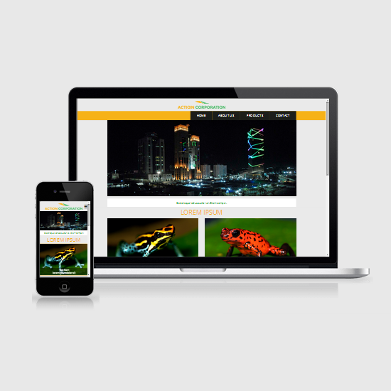
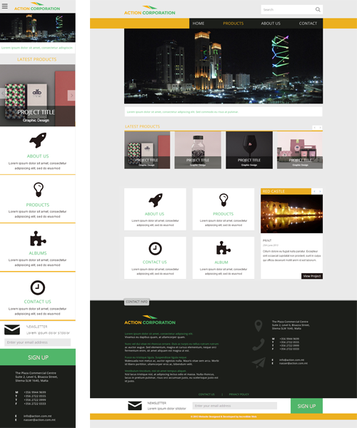
The website in question is the new responsive website for Action Corporation (which is still not in the live environment because of non-technical issues); a Libyan import-export company located in Malta. The first step of all our websites is to produce a static design (basically an image); which meets the clients' requirements. Since we are building a responsive website, we always include a desktop and a mobile version of the website as can be seen in the below image:
The first step was to set up the MVC framework, however I will not bore you with these details. The only thing worth mentioning is that the website is built upon the latest version of Umbraco 7, which also includes a beautiful (aka 'belle') responsive backend. We then have our own framework built upon Umbraco's so as to be able to abstract any Umbraco specific details from the client-facing views & view models.
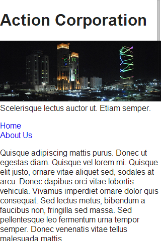
In perfect synchrony with progressive enhancement (and perhaps taken a bit too far), we have our first version of the webpage which does not include any CSS apart from that generated by the normalize scripts included as part of HTML5 Boilerplate (yes, this is part of our normal work process).
The good thing is that it works well across all devices and viewports, and sadly enough, that's more than can be said for the current site you are browsing. I also had to only write the following CSS (scss actually) to make sure that images aren't larger than the viewport. This contradicts what I said in the previous blog post responsive design, but would be sufficient for now:
 #homeBanner{
      img{
          width: 100%;
          height: auto;
     }
 }

 #featuredItems{
       img{
          max-width: 100%;
          height: auto;
     }
 }
The next step was to adjust the CSS to make the website look better than what we have up here. As we are developing mobile first, we obviously started by targeting the mobile devices, and included the use of CSS3's flexbox and could assume that most CSS3 selectors are going to be supported as we do not need to worry about IE6-9.
After a few hours of development, we finally have our beautiful website, which works well across all device viewports. Unfortunately there is not much to eleaborate on at this stage; the only thing worth mentioning is that all CSS media queries were in the format:
@media only screen and (min-width: 48em)
We also introduced media-queries in our JavaScript, so as to only run certain JavaScript (such as nivoSlider) on mobile devices or otherwise.
if (window.matchMedia("only screen and (min-width: 48em)").matches)
Single Page Application
OK, so we now have a nice working website on mobile and on desktop, but what about a single-page application (SPA)? A single-page application uses JavaScript to fetch and update content and provides a greatly improved user experience, especially on mobile devices where the minimisation of HTTP requests plays a more important role than on desktop's with fast internet connections.
To turn our website into a single page application was relatively straightforward, because all that was required was to add JavaScript events to intercept requests to the controller and preventDefaults(); and on the server-side simply check whether the request was an AJAX request and serve the content accordingly.
Client-side:
// clicking on a navigation item in the top menu
$(document).on('click', "nav#topMenu a", function(event){
    var self = $(this);
    // retrieve the URL of the anchor tag
    var url = $(self).attr("href");
    // ajax call
    $.get(url, function (response, textStatus) {
        // check the response
        if (response) {
            // update the content accordingly
            $("#main").html(response.main)
        }
    });
    // prevent the default browser functoinality associated with the anchor tag
    event.preventDefault();
});
Server-side:
// progressive enhancement allows for non-javascript browsers to work correctly
if (Request.IsAjaxRequest())
{
    // create the JSON object to return
    return Json(new
    {
        // retrieve the content from the CMS
        Main = GetPageContent()
    });
}
else
{
    // serve the view as per normal functionality
    ...
}
FAST CLICK
According to Google, "...mobile browsers will wait approximately 300ms from the time that you tap the button to fire the click event. The reason for this is that the browser is waiting to see if you are actually performing a double tap." On Action Corporation's website; we implemented FastClick by FT Labs to remove this delay and provide an improved user experience. Note that this delay is already removed for Chrome 32+ so it is only necessary to include it to improve the usability on older browsers.
All that is required to include FastClick is to reference the JavaScript file and instantiate it on the body's load event. That's all.
window.addEventListener('load', function() {
    FastClick.attach(document.body);
}, false);
Search Engine Optimisation
One of the greater advantages of having a fully responsive website that targets all users over having a mobile and desktop version of the same website is search engine optimisation. Google favours responsive design, the content is identical and the website is treated as one. This means that traffic aggregates, rather than is split onto two different URLs.
Using the technique mentioned in the Single Page Application sub-heading, all the website's pages are immediately crawleable by Googlebot without the need to run pre-render tools such as prerender.io or Scotch. This is because the entire website could run perfectly well without JavaScript and JavaScript is only required to improve the user-experience. For how much longer this will remain feasible as website's become more reliant on JavaScript remains to be seen, however by building mobile first you should guarantee good search engine optimisation.
Debugging
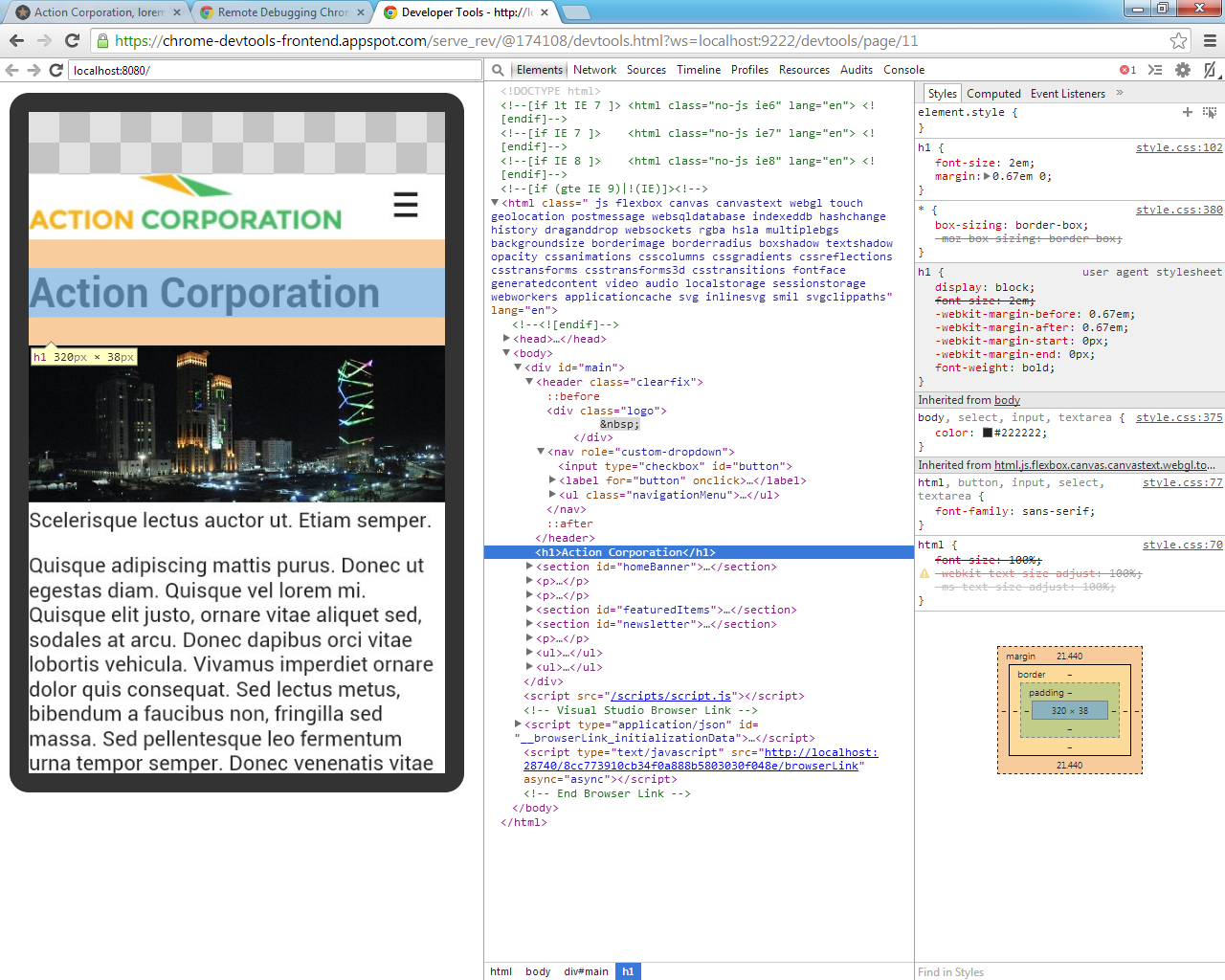
One of the coolest things I have recently learnt to do is remote debugging in Chrome. If you haven't ever done it, it might be a bit tedious to set up:
- Download Android SDK (http://developer.android.com/sdk/index.html)
- Install the Google USB Driver
- Enable USB Debugging on your mobile device
- Enable port forwarding through ADB by running the following command (note it must be run in cmd from the path where adb.exe is found):
adb forward tcp:9222 localabstract:chrome_devtools_remote - Finally, navigating to http://localhost:9222/ will show you pages which are currently open in Chrome on your mobile device...
- ...and by setting up port forwarding, it is possible to access your desktop's localhost through your device.
That's all for today. In the next blog I want to continue on the techniques used to develop this site, such as setting up grunt.js; AJAX includes and other fancy tools that all the cool kids are using.