
It is common knowledge that mobile internet usage is on the increase and the rate at which it is increasing should be of particular interest to web developers and investors alike. It is expected that by the year 2015 mobile internet usage will overtake desktop1, therefore making your old fashioned website unsuitable for more than 50% of the market. It is also astonishing that 80% of Facebook's traffic is originating from portable devices and it seems that no-one wants to sit down behind a computer and go through Facebook any longer2.
This is understandable in that time has become more valuable and browsing through Facebook could be done whilst waiting for the bus or in the queue at the supermarket. I for one, am writing this article whilst waiting at the dentist...in Poland.
And we can expect this to be the tip of the iceberg; as technology improves and coverage becomes more widespread and affordable, the number of mobile devices will keep growing and unless you jump onto the bandwagon early enough your business risks falling behind. It is estimated that on average eBay Motors UK sells a motor vehicles every 3 minutes from mobile devices alone3, which for me is an amazing statistic. The purchase of a motor vehicle is personally always a big deal and the ability to do this on my mobile (whist in Poland at the dentist) is something which I still have to wrap my head around. But that's the future present of online business.
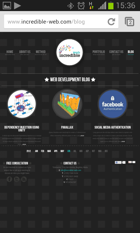
If you are reading this from your mobile device, you may or may not have noticed that this website, at the time of publishing this post is not optimized for portable devices. It probably looks like this, which might be legible but it is still a bit tedious to pinch and zoom to be able to read some bits:
This should be the very minimum your website should be, fast to load (compressed files, caching, CDNs...etc) and legible. If someone would be really in need of something from your website, they could actually reach it. But if the same "something" is also available on your competitor's mobile-friendly website, the chances are you have just lost one customer. This is especially true for return customers, where using your website is part of the service being offered, such as a blog or news site or an online casino, sportsbook...etc. As mentioned earlier greater emphasis has been placed on time, and it is understandable that a customer will find an alternative immediately if your website is proving to be too time consuming. I regularly gamble my savings away on the weekend's football games and when I am with my friends or at the bar, I do not want (or cannot) get access to a desktop PC and I "need" to place an urgent bet to atleast rescue part of my stake. The website I use is the one which can accommodate me quickest, regardless of who offers the best odds or bonuses (playing around with your mobile when in company is a bit disrespectful in my opinion; apart from the fact that someone could score a goal, throwing your bet out of the windows.)
Back on topic...when building a new website, developing a mobile-friendly version should be a very fundamental consideration (more than catering for Internet Explorer 7 users), yet very often this is simply ignored completely. When developing our own site we had a mobile optimized version in the plans but had to postpone this because the technology we wanted to apply (responsive design) was in its infancy and our priority was our client's websites; in maltese there is a saying that when translated goes: "the shoemaker wears torn shoes".
There are two serious options when considering mobile web development, a copy of the site built solely for mobiles (using its own css and HTML) or the newer and my preferred option, responsive design. Maintaining two copies of the same website is bound to result in increased maintenance and having an engineering background I do not see it as a very scientific approach.
In this blog we will start with an introduction to responsive design, including some invaluable resources I have come across, but it is interesting to understand that I am not some responsive design guru (although admittedly I have done my research and even used it on rate occasions beforehand) but by the end of these few blog entries I hope to be one and hopefully you would be too. So if you need clarification on anything or can correct me or improve my designs, please let me know.
Responsive design is the use of CSS selectors which take into consideration the width (in pixels, ems or rems) and orientation of the device being used. This allows for a very advantageous feature over redesigning the website for mobile devices in that the width of the device is flexible, because let's face it, the definition of a mobile device is very ambiguous. I am currently using a 4-inch touchscreen on my mobile, but someone could be accessing the same content from a 12-inch tablet, therefore when designing the mobile site, should it be targeting 4-inch or 12-inch screens? Using responsive design, the device's width is simply another variable and you are not constrained to target a particular device or size. The goal is to deliver the same content and functionality but in a different layout. Omitting something useful from mobile device users is not the right way to go. Nielsen Norman Group stated in early 2009: "You should design different Web sites for each mobile device class-the smaller screen, the fewer features, and the more scaled back your design." We will not engage into a discussion whether NN/g was correct or not, but they had also predicted a "dark future for m-commerce sites" so we don't really want to listen to them do we?
Below are a bunch of links that I recommend you read before we really get going with the fun part:
- http://alistapart.com/article/responsive-web-design
- http://alistapart.com/article/dao
- http://www.html5rocks.com/en/mobile/responsivedesign/
- http://trentwalton.com/2013/02/07/where-to-start
- http://blog.teamtreehouse.com/beginners-guide-to-responsive-web-design
See you in 4 weeks (enough time to read the above links and more). Until then, happy coding.
Kevin
1 http://news.cnet.com/8301-1023_3-57556943-93/mobile-internet-traffic-gaining-fast-on-desktop-internet-traffic/
2 http://www.uxmatters.com/mt/archives/2013/06/three-reasons-weve-outgrown-mobile-context.php